Tanya Poll's series titled "There's No Place" is a similar project to mine, in that it contains images taken on a journey through a location. Her's contains images from London, Tokyo, Melbourne and Auckland.
I have taken an image a lot like this one for my project, but mine is a lot more colourful. I think that the image works because its really simple and its something we see everyday but don't really notice - a theme which is present quite heavily in my own project.
I think that the images in this series are interesting for one reason in particular - you have to look at them properly before you can tell exactly what it is. Tanya Poll takes images of mundane, everyday things in an exciting and different way. For example, this image of a tree was taken from the reflection of a puddle or a pool of water. Different viewpoints are something that I have taken into consideration in my own images.
This image is quite different, it looks pretty straightforward, but I think that its more about the lines produced and the composition than it is about the way the image is presented. I think that it looks interesting visually while still providing the series with some variation within the images.
Thursday, 24 February 2011
Thursday, 17 February 2011
Jessica Backhaus
After some discussion with a tutor, she advised me to look at Jessica Backhaus - Link HERE - in particular, her series titled "One Day in November".
I think her images are really cool and they all have a look to them that I can't quite describe. The Formalist structures are really evident in all of her images, not just the ones that I have chosen.
Her use of lines is really interesting and in the last image, the use of shadows is quite effective too. They're similar to the images I take whenever I'm out and about, which you can see on my Flickr.
I think her images are really cool and they all have a look to them that I can't quite describe. The Formalist structures are really evident in all of her images, not just the ones that I have chosen.
Her use of lines is really interesting and in the last image, the use of shadows is quite effective too. They're similar to the images I take whenever I'm out and about, which you can see on my Flickr.
Wednesday, 9 February 2011
more trish morrissey
i was just scouring the web and found this:
Minus the two girls, this is the kind of location I'm gonna be shooting in. So imagine a shot like this but with a guy instead. :)
ideas
I think that whilst I have my heart set on shooting in Bushy Park (or Home Park, they're both the same.) its good that I can look at other places too. Such as Richmond Park.
Richmond Park is such a nice place. I took a Medium Format film when I was there, this was a learning curve for me as I had never used Medium Format before and I found it really quite easy to pick up.
Yeah, so. Good. I still think that I'm gonna shoot in Bushy Park. I should hopefully have photographs this weekend. Maybe on Monday if you're lucky. :)
Richmond Park is such a nice place. I took a Medium Format film when I was there, this was a learning curve for me as I had never used Medium Format before and I found it really quite easy to pick up.
Yeah, so. Good. I still think that I'm gonna shoot in Bushy Park. I should hopefully have photographs this weekend. Maybe on Monday if you're lucky. :)
Thursday, 3 February 2011
boom photographer binge
Trish Morrissey
Trish Morrissey's series of Photographs titled "Seven Years" are ones in which she recreates photographs from her family album, using the same location and same people, just at a later period - so naturally, the place would have changed a bit and the people will have become a lot older. I find this really interesting and it's definitely something I wish to follow. I really like that while I know it's staged, it could quite easily be a holiday snap at the same time.
Here's a few of my favourites from the series.

The idea of recreating scenes from memory fascinates me. I think its a combination of the personal memories that the photographs hold with the nostalgic feel they all have.
My childhood was all fields and playgrounds and spending hours on end just messing around in fields and only coming home for food and then i'm back out getting muddied up. I think I might recreate this now, but as I can't physically go home and back to the locations I spent time in, I plan to recreate the photographs here in Kingston.
So yeah, this work by Trish Morrissey will probably be my main influence during this project.
John Szarkowski
Szarkowski has photographed open space really well and I think that although he used B/W film rather than colour doesn't really matter because he's still managed to capture the space really effectively. However, I think that if he did use colour then the photographs would have a completely different feel to them. There's just something special about photographing the space in B/W that would be lost if he used colour, I think.
Trish Morrissey's series of Photographs titled "Seven Years" are ones in which she recreates photographs from her family album, using the same location and same people, just at a later period - so naturally, the place would have changed a bit and the people will have become a lot older. I find this really interesting and it's definitely something I wish to follow. I really like that while I know it's staged, it could quite easily be a holiday snap at the same time.
Here's a few of my favourites from the series.
The idea of recreating scenes from memory fascinates me. I think its a combination of the personal memories that the photographs hold with the nostalgic feel they all have.
My childhood was all fields and playgrounds and spending hours on end just messing around in fields and only coming home for food and then i'm back out getting muddied up. I think I might recreate this now, but as I can't physically go home and back to the locations I spent time in, I plan to recreate the photographs here in Kingston.
John Szarkowski
Szarkowski has photographed open space really well and I think that although he used B/W film rather than colour doesn't really matter because he's still managed to capture the space really effectively. However, I think that if he did use colour then the photographs would have a completely different feel to them. There's just something special about photographing the space in B/W that would be lost if he used colour, I think.
Thursday, 27 January 2011
New Term. New Project.
Imagined Places
For this project, I intend to do a series of Portraits based on places that I remember from home. Seeing as I can't physically go home to do this project, I plan on re-creating scenes from memories in a different location.
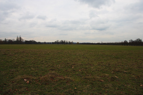
I've been on a Location hunt and I found a massive field just outside Kingston, Hampton Court Park.
It reminds me of home, somehow. Maybe it's the acres of open space that are so common at home, but are a rarity in London? I dunno, but its really quite cool and I definitely plan on using it in this project. I might even go back later and do some self portraits there.. maybe.
Another place that I often associate with my childhood is a playground, naturally. I found a really cool playground which is shockingly similar to one back home, so I may use this, too.
Sunday, 2 January 2011
it...got away from me.
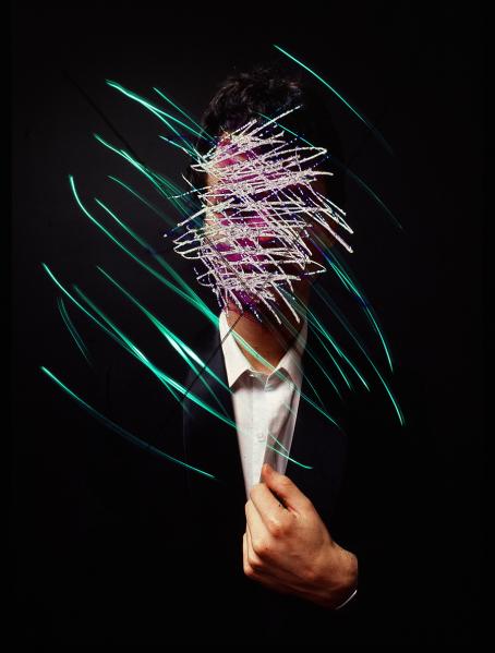
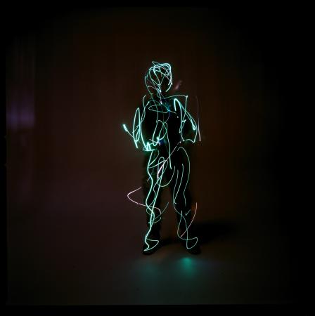
Chip Simons. Light Paintings.
using LED lights to create crazy patterns and shapes, almost at random.
its the fact that i have little or no control over the image, I just have the light to move around that I find so intriguing.
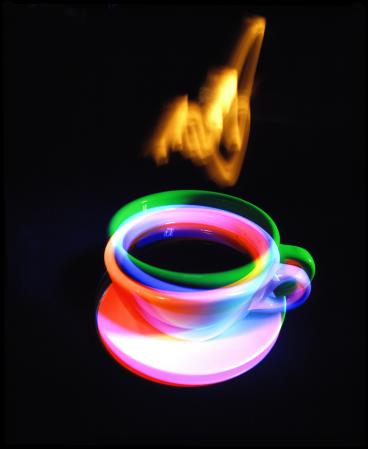
using familiar objects, shapes, figures and drawing around them.
creating a sense of motion by using simple things such as light.
almost like taking 3 different exposures. they all make it really interesting.
using LED lights to create crazy patterns and shapes, almost at random.
its the fact that i have little or no control over the image, I just have the light to move around that I find so intriguing.
using familiar objects, shapes, figures and drawing around them.
creating a sense of motion by using simple things such as light.
almost like taking 3 different exposures. they all make it really interesting.
Saturday, 23 October 2010
i should really do this more often...
Armed with a few photographers, I got to research!
Darren Almond, Chrystel Lebas and Bill Henson. These were suggested to me by a tutor at University, so I went and looked them up - and here I am!
Darren Almond
I ended the last post on the thought of doing formalism, but upon realising how amazing the sky is both at sunset and and sometimes during total darkness, I decided I might go on to shoot at night. This is for my book project, which will contain (hopefully) around 10-20 different images.
Basically, a reallllllly long exposure at night would give me a star trail sort of effect, kind of like what happens when cars go past when you're doing a 10 second exposure. I think though, to acheive this I'd have to get a remote that set the shutter off (because I don't fancy holding the button down for an hour or two!

I'd love to create an image like the one at the top, its just so different and unique that I feel would work very well in my project. Hopefully I do get the chance
to shoot an image like that. The composition, too - the way the foreground is completely still and peaceful - it almost looks like its day time.
Secondly, shooting from a location where I can create silhouettes would be a good thing to do, too. I think that dark, strange shapes against a bright, colourful sky would work really well. Again depending on the exposure and time of day, the image would either come out looking like this image to the left, or one just below. I think that the sky works a whole lot better in this first picture than it does in the bottom one. The way that all the detail is taken out of the trees and hills in the background really makes you look at the sky.
Chrystel Lebas
Chrystel Lebas' work is similar to Almond's work in that it features the sky, but in her latest work "Between Dog and Wolf", she tends to focus on the colours and how different colours can compliment each other in a photograph. I intend to apply this to my work by taking images that use a crazy skyline but also using colours that work really well together. In this first image, the blue-tipped flowers really work well against the green of the trees. Again, the silhouette effect is used on the tress - almost as if they're just black lines with just a tiny bit of detail on the trunk.
This image, also by Lebas, is one which features almost nothing but sky. There's the odd bit of the hills in there, but the sky dominates the photograph. The colours created by the sky suggest to me that the image was taken around sunset, when the sky produces the most amazing colours, from gold to sometimes even purple. It's these colours that also make me want to shoot
the sky at night.
This image is really great. Silhouetted (...again!) is the foreground of the photograph, with the background of the sea, horizon line, sky and the sun in great detail and amazing colour. The rich blue colours really stand out against the dark black of the foreground.
Here, the sky is creating all sorts of colours, which is really quite beautiful. The way the image is once again sorted into a silhoutte foreground and a bright, colourful background suggests to me that this is Lebas' style - which works immensely. The soft focus works very well, too, leaving out the detail in the edges of the silhouettes is really quite effective.
Bill Henson
The winning formula this time produced by Bill Henson. Silhoutte foreground and colourful background. Seems to be the way to go! However, with Henson's images, the detail isn't completely lost in the silhouettes. The edges are still sharp as knives, with each leaf and branch being accounted for. Still, I find them to be really effective, to the same standard as those produced by Lebas.

This one has a slightly darker tone to it, as the colours in the sky aren't so amazing as the others are. The darker clouds, however, work pretty effectively against the duller sky
Again, no detail lost. The power cables coming from the pylon are still clear as anything. The patterns formed by the clouds in the sky - each with a different colour - makes this image look almost like a painting, which is really cool.
oh. and. that's me finished.
Darren Almond, Chrystel Lebas and Bill Henson. These were suggested to me by a tutor at University, so I went and looked them up - and here I am!
Darren Almond
I ended the last post on the thought of doing formalism, but upon realising how amazing the sky is both at sunset and and sometimes during total darkness, I decided I might go on to shoot at night. This is for my book project, which will contain (hopefully) around 10-20 different images.
Basically, a reallllllly long exposure at night would give me a star trail sort of effect, kind of like what happens when cars go past when you're doing a 10 second exposure. I think though, to acheive this I'd have to get a remote that set the shutter off (because I don't fancy holding the button down for an hour or two!

I'd love to create an image like the one at the top, its just so different and unique that I feel would work very well in my project. Hopefully I do get the chance
to shoot an image like that. The composition, too - the way the foreground is completely still and peaceful - it almost looks like its day time.
Secondly, shooting from a location where I can create silhouettes would be a good thing to do, too. I think that dark, strange shapes against a bright, colourful sky would work really well. Again depending on the exposure and time of day, the image would either come out looking like this image to the left, or one just below. I think that the sky works a whole lot better in this first picture than it does in the bottom one. The way that all the detail is taken out of the trees and hills in the background really makes you look at the sky.
Chrystel Lebas
Chrystel Lebas' work is similar to Almond's work in that it features the sky, but in her latest work "Between Dog and Wolf", she tends to focus on the colours and how different colours can compliment each other in a photograph. I intend to apply this to my work by taking images that use a crazy skyline but also using colours that work really well together. In this first image, the blue-tipped flowers really work well against the green of the trees. Again, the silhouette effect is used on the tress - almost as if they're just black lines with just a tiny bit of detail on the trunk.
This image, also by Lebas, is one which features almost nothing but sky. There's the odd bit of the hills in there, but the sky dominates the photograph. The colours created by the sky suggest to me that the image was taken around sunset, when the sky produces the most amazing colours, from gold to sometimes even purple. It's these colours that also make me want to shoot
the sky at night.
This image is really great. Silhouetted (...again!) is the foreground of the photograph, with the background of the sea, horizon line, sky and the sun in great detail and amazing colour. The rich blue colours really stand out against the dark black of the foreground.
Here, the sky is creating all sorts of colours, which is really quite beautiful. The way the image is once again sorted into a silhoutte foreground and a bright, colourful background suggests to me that this is Lebas' style - which works immensely. The soft focus works very well, too, leaving out the detail in the edges of the silhouettes is really quite effective.
Bill Henson

This one has a slightly darker tone to it, as the colours in the sky aren't so amazing as the others are. The darker clouds, however, work pretty effectively against the duller sky
Again, no detail lost. The power cables coming from the pylon are still clear as anything. The patterns formed by the clouds in the sky - each with a different colour - makes this image look almost like a painting, which is really cool.
oh. and. that's me finished.
Thursday, 14 October 2010
Fresh from the last darkroom session, I produced a series of prints today.
I really like how every single one turned out, even if it did take a while to get used to printing again. (Even then, it was nothing like what i'm used to, there's a machine that develops for you...its such a time-saver! you hear this, Adrian Cowin?)
Yeah, so basically, I originally chose five, but the fifth image didn't turn out as i'd hoped - so I scrapped it. "Looking at things differently" was the basis of the project - and I think I interpreted it in a unique way. Reflections in Puddles, great depths of field and repeated patterns were the basic jist of it. My personal favourites are the bike and the railing, which I find to be pretty interesting and abstract.
I think i'm going to go down the route of formalism in Photography. Also, today we looked at ways of producing books - and realised that the final outcome (the book) doesn't have to fit the conventional style... it can take any shape, form or colour...so I've got a few ideas rattling around the old head...I might delve into them in a later blog. if you're lucky. :)
PEACE. :D
Friday, 8 October 2010
contact sheets and negatives
So, keen as mustard to get back into the darkroom... I present to you, my negatives!
Sticking them to the windows doesn't really do them any justice, but its the closest I can get to a lightbox here at Student Central. The idea was to "take the 'of' out of the photograph" - basically, take photographs that aren't really of anything. My images ranged from plain and simple shots of stairs, to crazy, arty shots of reflections in puddles.
It took me a while to get used to film again, with my first film being a complete and utter failure. However, I managed to man up and get a second film done and completed properly (which is the one to the left).
Basically, I'm really proud of this film - as its the first one i've done in about 6 months, if not longer. So yeah. More on this darkroom stuff as it happens... [/newsreader]
Also, naturally - from negatives come prints! ...or rather a contact sheet..

so yeah. on the left is the test strip, doubling it each time. 2 seconds, 4 seconds, 8 seconds, 16 seconds, 32 seconds. I decided on the 32 second exposure, which gave me the contact sheet on the right. As it was just for testing purposes, all of the images are not quite perfect - some are overexposed and some are under, but to get a general sense of exposure times the sheet on the right was produced. Notice that some of the images have white lines and boxes drawn underneath/around them. That was my way of narrowing down the images for selection. Originally I drew a line under the images I wanted to look at properly, then narrowed it down even more by drawing a box around the ones I was going to use as my final images. I ended up with 4 final images which have yet to be printed.
Laters haters.
Sticking them to the windows doesn't really do them any justice, but its the closest I can get to a lightbox here at Student Central. The idea was to "take the 'of' out of the photograph" - basically, take photographs that aren't really of anything. My images ranged from plain and simple shots of stairs, to crazy, arty shots of reflections in puddles.
It took me a while to get used to film again, with my first film being a complete and utter failure. However, I managed to man up and get a second film done and completed properly (which is the one to the left).
Basically, I'm really proud of this film - as its the first one i've done in about 6 months, if not longer. So yeah. More on this darkroom stuff as it happens... [/newsreader]
Also, naturally - from negatives come prints! ...or rather a contact sheet..
so yeah. on the left is the test strip, doubling it each time. 2 seconds, 4 seconds, 8 seconds, 16 seconds, 32 seconds. I decided on the 32 second exposure, which gave me the contact sheet on the right. As it was just for testing purposes, all of the images are not quite perfect - some are overexposed and some are under, but to get a general sense of exposure times the sheet on the right was produced. Notice that some of the images have white lines and boxes drawn underneath/around them. That was my way of narrowing down the images for selection. Originally I drew a line under the images I wanted to look at properly, then narrowed it down even more by drawing a box around the ones I was going to use as my final images. I ended up with 4 final images which have yet to be printed.
Laters haters.
Thursday, 7 October 2010
Camera Lucida.
apparently, i'm getting good at this.
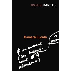
I bought a book yesterday after being told about it by a tutor. "Camera Lucida" by Roland Barthes (funnily enough, Idris Khan - who was one of the subjects of yesterday's post photographed this book!) is the book in question. In anticipation of the book arriving (with a slight hint of excitement) I rented a copy of the book from the University Library and began reading it on the bus home. I'm currently on the 41st page (or Section 17), which isn't that far in to be fair. I was sidetracked by Skype and Miami Vice. But really, the book is really something which looks at Photography in a completely different way, a way that i've never even considered looking at it before. Its a real eye-opener and, for lack of a less-common adjective, a "Must-Read".
Here's the Book on Amazon.
Basically, I picked this book up on one suggestion and I have only stopped to watch Miami Vice and Skype to people.
It'll be the best £4.99 you ever spend. unless you know how to really haggle.
I bought a book yesterday after being told about it by a tutor. "Camera Lucida" by Roland Barthes (funnily enough, Idris Khan - who was one of the subjects of yesterday's post photographed this book!) is the book in question. In anticipation of the book arriving (with a slight hint of excitement) I rented a copy of the book from the University Library and began reading it on the bus home. I'm currently on the 41st page (or Section 17), which isn't that far in to be fair. I was sidetracked by Skype and Miami Vice. But really, the book is really something which looks at Photography in a completely different way, a way that i've never even considered looking at it before. Its a real eye-opener and, for lack of a less-common adjective, a "Must-Read".
Here's the Book on Amazon.
Basically, I picked this book up on one suggestion and I have only stopped to watch Miami Vice and Skype to people.
It'll be the best £4.99 you ever spend. unless you know how to really haggle.
Wednesday, 6 October 2010
50 photographers of tomorrow.
I write this at the end of a very interesting day at University. I developed my first film since around April (needless to say i'd forgotten how to do a lot of it...sorry Isle of Man College.) and I was shown a book called "re-Generation: 50 Photographers of Tomorrow". Whilst there were a lot of images from various different photographers, each with their own style, I became fixed on this one guy - Matthias Bruggmann.
Brugmann's work can be seen here, on his Flickr page.
Basically, I can't put my finger on just one thing that I love about his photographs - however, the use of colour and the way he photograps the simplest things in a different way are probably some of the reasons.
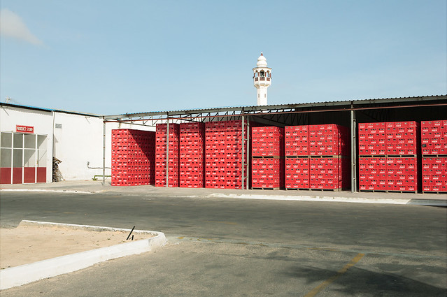
This was from a Coca-Cola Bottling Plant in Somalia. Whilst it looks like a really simple image, the patterns formed by the crates are quite cool. The white specks on the deep red are really quite effective. (Original is here.)
Another Photographer I was introduced to today is Idris Khan. Idris Khan's work is really unique in that its something that i've never seen used so effectively before. When he was at University, he's tutors were accomplished photographers in their own right, who shot photographs a certain way and (if I remember rightly) wanted the students to shoot the same way, too. So Idris took that idea and went right over the top with it. An example is, a tutor set him the task of photographing a circular structures, so Idris photographed every single circular structure he could find and exposed them all onto the same piece of paper - producing this image.
Edit: I feel obliged to provide a link to Idris Khan's stuff - so here: http://www.saatchi-gallery.co.uk/artists/idris_khan.htm
Brugmann's work can be seen here, on his Flickr page.
Basically, I can't put my finger on just one thing that I love about his photographs - however, the use of colour and the way he photograps the simplest things in a different way are probably some of the reasons.
This was from a Coca-Cola Bottling Plant in Somalia. Whilst it looks like a really simple image, the patterns formed by the crates are quite cool. The white specks on the deep red are really quite effective. (Original is here.)
Another Photographer I was introduced to today is Idris Khan. Idris Khan's work is really unique in that its something that i've never seen used so effectively before. When he was at University, he's tutors were accomplished photographers in their own right, who shot photographs a certain way and (if I remember rightly) wanted the students to shoot the same way, too. So Idris took that idea and went right over the top with it. An example is, a tutor set him the task of photographing a circular structures, so Idris photographed every single circular structure he could find and exposed them all onto the same piece of paper - producing this image.
So that's what i've learnt today.
Over and Out.Edit: I feel obliged to provide a link to Idris Khan's stuff - so here: http://www.saatchi-gallery.co.uk/artists/idris_khan.htm
Tuesday, 5 October 2010
henri cartier-bresson
whilst not necessarily a landscape photographer, his use of formalism in photographs is astounding.
in particular, this image. the use of the railing leading the eye down to the bicycle is really effective. also, the fact that HCB has caught this image at this exact time is crazy. if it was a couple of miliseconds either before or after, then the cyclist wouldn't have been there and the whole focus of the image would be completely changed.
I love his work. All of it. I recently took out a book of his, entitled "Scrapbook" - which is basically (as the title would suggest) a collection of all of his work with a short written piece preceding the photographs documenting his life.
I suggest that anyone interested in looking further into HCB to get a hold of this book and simply look at it. Its blown me away - many of the photos i'd never even seen before, so for me it was a whole new experience. Looking at his work, getting a sense of emotion from it, the way he uses lines, curves and other natural shapes to create astounding scene are really quite effective.
peace from the man.
in particular, this image. the use of the railing leading the eye down to the bicycle is really effective. also, the fact that HCB has caught this image at this exact time is crazy. if it was a couple of miliseconds either before or after, then the cyclist wouldn't have been there and the whole focus of the image would be completely changed.
I love his work. All of it. I recently took out a book of his, entitled "Scrapbook" - which is basically (as the title would suggest) a collection of all of his work with a short written piece preceding the photographs documenting his life.
I suggest that anyone interested in looking further into HCB to get a hold of this book and simply look at it. Its blown me away - many of the photos i'd never even seen before, so for me it was a whole new experience. Looking at his work, getting a sense of emotion from it, the way he uses lines, curves and other natural shapes to create astounding scene are really quite effective.
peace from the man.
This blogging business...
I am relatively new to this blogging lark. I mainly set it up to use as a research journal book thing, to co-exist with my sketchbook stuff.
Basically, anything I see that takes my fancy in the Photography-Arty world will be posted here with thoughts, comments and anything else I find to be interesting. Here's a photographer I'm currently looking at who specialises in Landscapes, mainly rural... his name is Joe Cornish. He's a great influence on me as I find the composition and colours in a lot of his images to be so stunning - which I also struggle to find in many other landscape photographers.
Joe Cornish Official Website
However, I am trying now to move away from Rural Landscapes - as I now live in a very Urban area (London's pretty urban...actually, its as urban as it gets..) so I will be posting back again with new photographers that I have found (some new, some old). But for know, drool over Joe Cornish's amazing seascapes.
LOVE.
Basically, anything I see that takes my fancy in the Photography-Arty world will be posted here with thoughts, comments and anything else I find to be interesting. Here's a photographer I'm currently looking at who specialises in Landscapes, mainly rural... his name is Joe Cornish. He's a great influence on me as I find the composition and colours in a lot of his images to be so stunning - which I also struggle to find in many other landscape photographers.
Joe Cornish Official Website
However, I am trying now to move away from Rural Landscapes - as I now live in a very Urban area (London's pretty urban...actually, its as urban as it gets..) so I will be posting back again with new photographers that I have found (some new, some old). But for know, drool over Joe Cornish's amazing seascapes.
LOVE.
Subscribe to:
Posts (Atom)